Czech version of the “Fabled Kingdom” series v1-3 complete (from publisher Zanir)

I will be eternally grateful to Czech publisher Zanir for translating and producing this beautiful hardcover Czech version of “Fabled Kingdom”, and to the translator for their hard work on what must have been a very difficult title to translate. It’s a comics-prose story, so it couldn’t have been easy. Special thanks to Jan Schejbal for putting all this together, you were a pleasure to deal with!

You can buy the series on their website here: https://www.zanir.cz/bajne-kralovstvi/

Colouring Tests: Fabled Kingdom Chapter 2

After my colouring tests for Chapter 1, I’ve now moved onto the colouring test for Chapter 2 for “Fabled Kingdom”. This is different to Chapter 1, because these are all scenes set at night, which means that the colours would all be darker and duller. I had to use the same palette as Chapter 1, because I don’t want the colours to look different chapter-by-chapter, and the end result is that the colours turned out somewhat dull.

I’m not quite happy with these colours, but I realise that if I were to use the same palette, this sort of thing is unavoidable. That said, I’m currently moving onto my next project, which uses the same palette from a totally different drawing style, so I may put this down for now, while I do my next work.

Colouring Tests: Fabled Kingdom Chapter 1

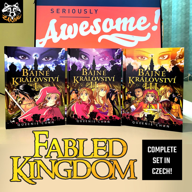
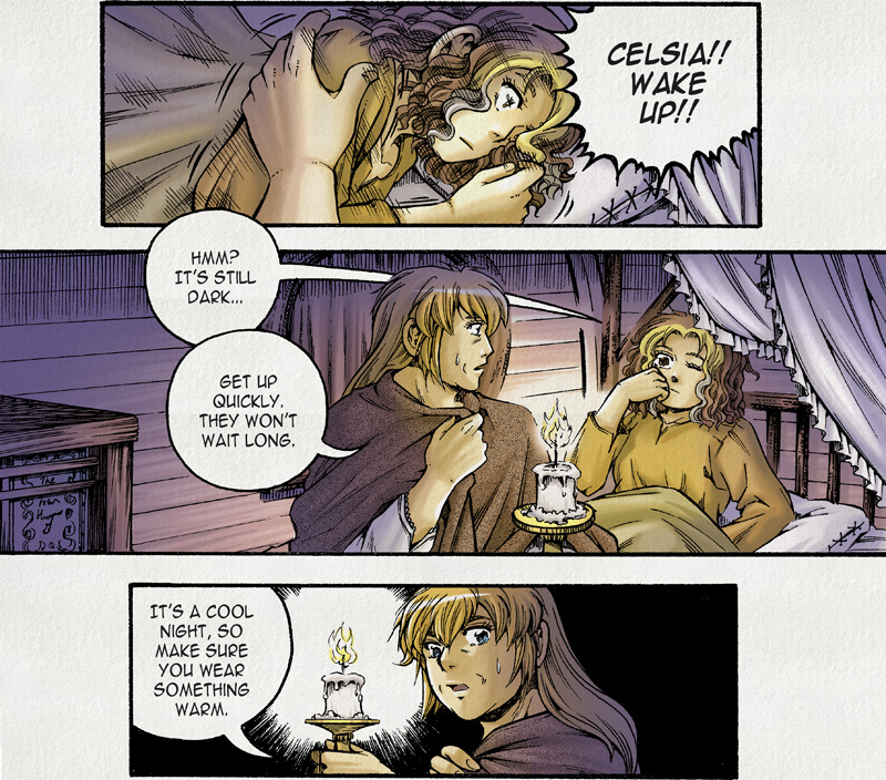
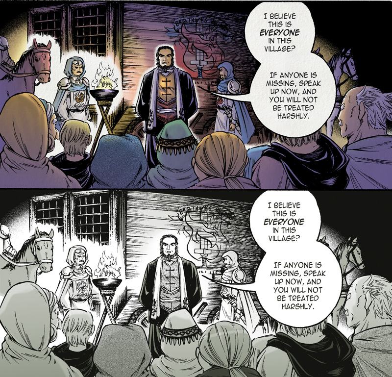
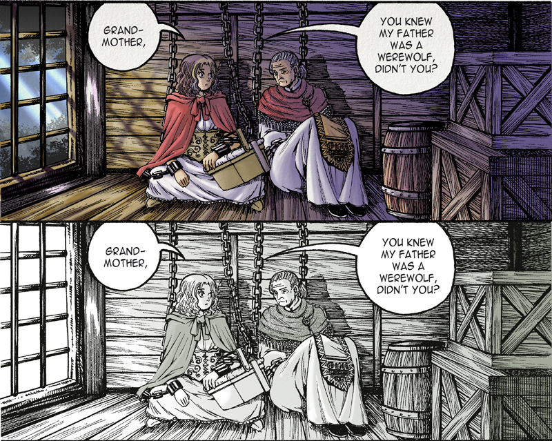
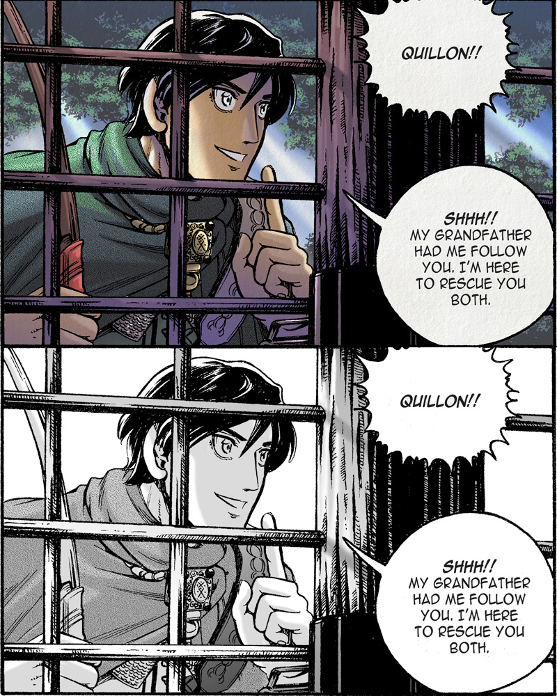
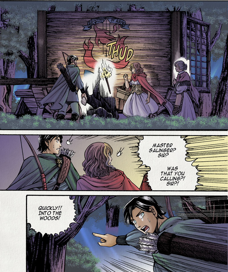
I’ve been doing some colouring tests, with the goal of moving towards doing colour comics. Despite having drawn comics for almost 20 years now, I feel that my biggest weakness has always been my aversion to colour. After drawing manga-style black-and-white (or greyscale like The Dreaming) for so long, I think I’ve done all there is to do on that style of art, and it’s time to move onto something else.

For this reason, I’ve been looking to build a colour palette I’m comfortable, and learning to use it. I started colouring Fabled Kingdom art from Chapter 1 as practise, and so far, it looks surprisingly good. Each took 2-3 hours at the most to do – I deliberately limited myself to the amount of time allowed since colouring is about speed as well as quality.


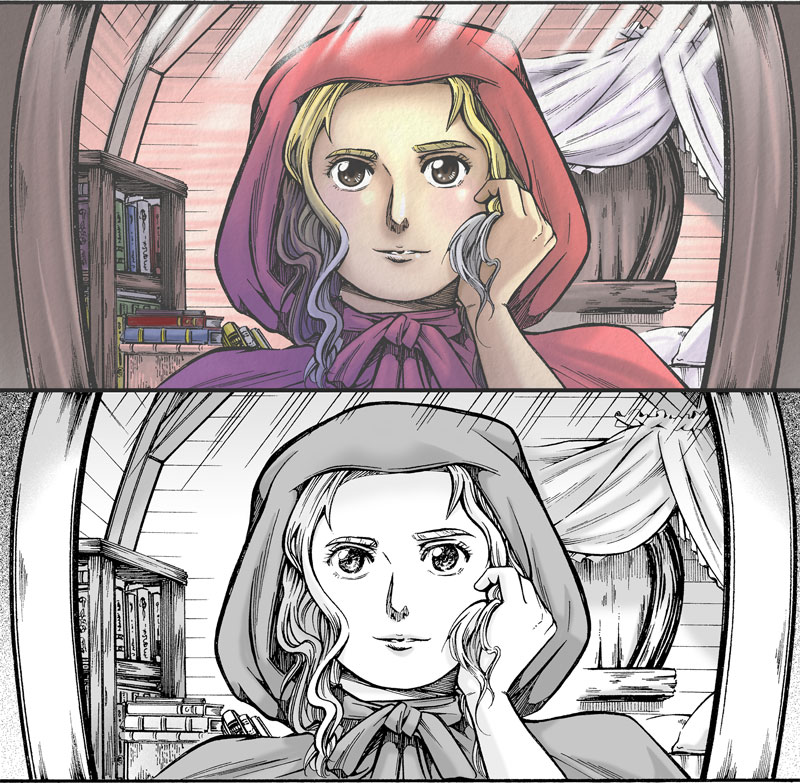
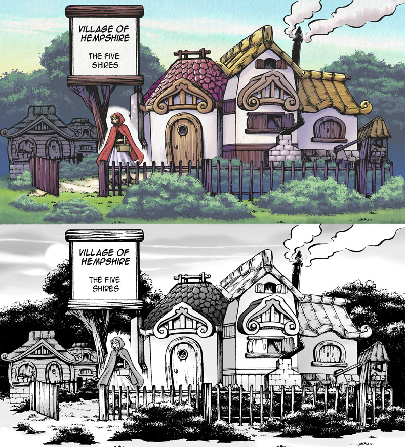
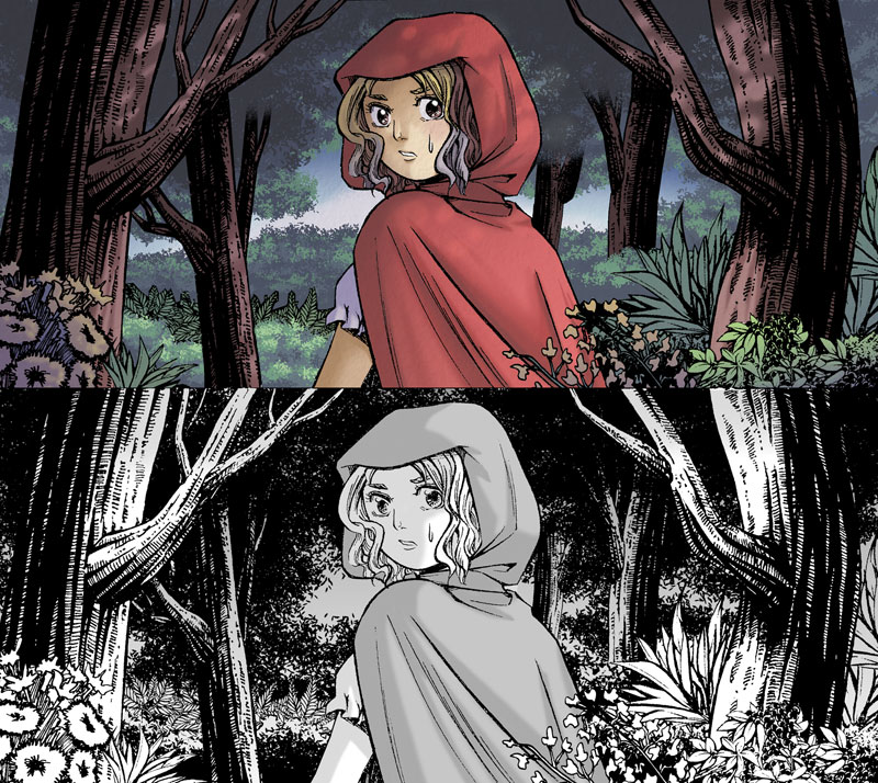
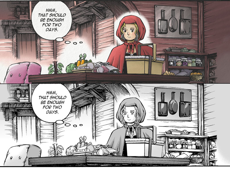
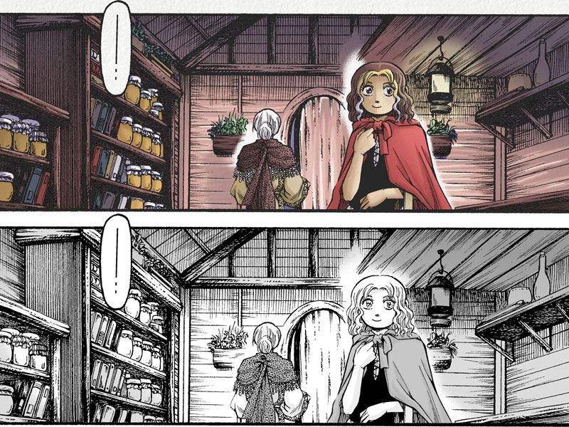
In the end, I’m actually looking for a more simple colouring style, so my colour comics will probably not look like this. I’ll probably aim to change my drawing style to something more cartoony and western to suit a two-tone colour palette, unlike this one which has 3-4 tones for each colour.

Bizarre Note: I’ve shown my colouring to a number of people, and while most agree that the colours look beautiful, some openly preferred the greyscale version. Interesting to see why they do that, but hey, everyone has their preferences. At the end of the day, what matters is the story and characters.